CRISPR for Twitter
There’s a Chrome extension that lets you install “themes” to alter the appearance of specific websites. I hacked together one such theme that behaves like CRISPR for Twitter: it lets you precisely snip out certain things, while leaving the rest to function normally.
I snipped out a lot. Here’s what Twitter looks like for me now:
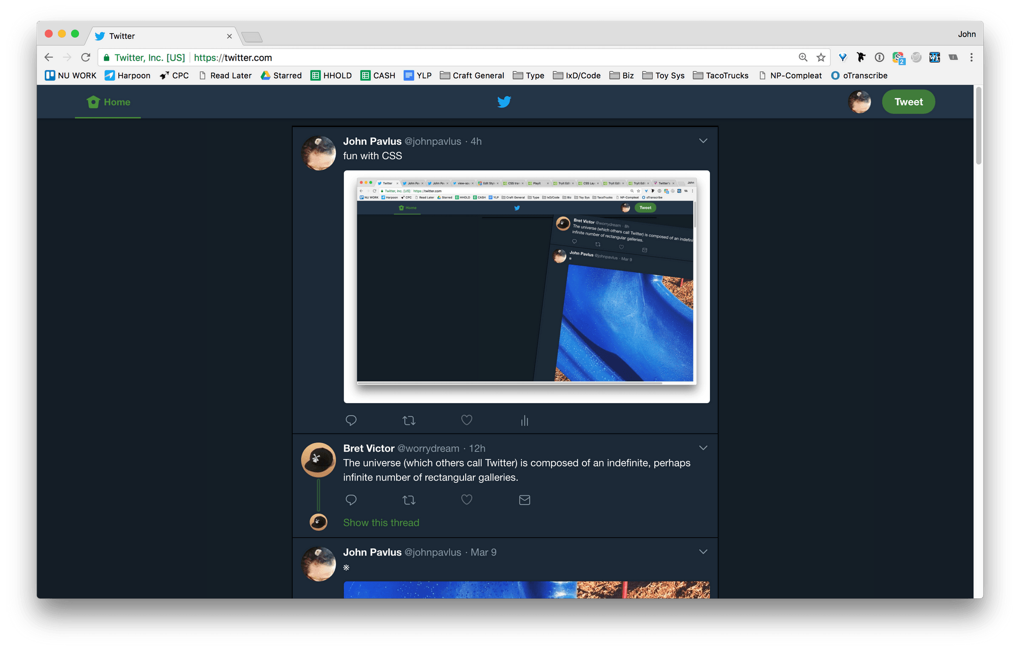
As you can see, it’s barely a social network anymore; it’s more like a harmless linkblog. (Think kottke.org crossed with txt.fyi.)
If you want to do likewise:
- Install the Stylus extension
- Install the Tame Twitter theme
- {optional} Manually edit the theme’s CSS to restore or kill specific elements of twitter.com per your own preferences, if you don’t like exactly how I arranged it 👈{this is the CRISPR-y part}
NOTE: Step 3 is not hard. I don’t even know CSS, and I managed it. I added some comments in the code (marked with /*) to help label which lines will kill specific features on Twitter.
E.g.:
.moments /* kills Moments tab */
{
display:none;
}
If you want to put Moments back in, you just delete those lines. Same for the other features.
Recommended: install the Hide Counts theme too. It removes all those soul-destroying metrics from the Twitter interface (e.g., follower counts, how many RTs or Likes a post got, &c.).
Gory details
Here’s everything I CRISPR’d out of Twitter, and why:
Tabs for Notifications and DMs. These are attentional sandtraps. I would helplessly check them even when I hid the counts, even though I hardly ever get @-replies or DMs. Now they’re totally out of sight, out of mind. (On the rare occasion that someone does DM me, Twitter sends me an email.
Same for the @s: I set up an IFTTT applet to send them as a once-a-day email digest. I can click direct links to view DMs and @s back on Twitter, and they’ll display normally.I turned this off and just decided to let Twitter email me about @s if they pile up.)Trends, Live Video, and Who To Follow. All noise.
Colophon (“© Twitter”, &c.) and “Advertise with Twitter” boxes. Quieter noise, but still noise.
Moments tab. Seriously?
Profile box in the upper left. LinkedIN-esque distraction. If I think too much about how I’m “presenting” on the network, I’ll spend hours rewriting my profile copy and fussing with my header image. (I actually did that today, which finally convinced me to kill this box.) If I really need to access or edit my own profile, I can just click the tiny avatar in the upper right hand corner, or hover over one of my own tweets.
”What’s happening?” tweet-box on top of the timeline. Also distracting. The mere presence of this empty input field gives me a nagging impulse to fill it, even if I just came to read some tweets. If I really want to post, I can click that little green button in the corner. (Or use this extension to tweet right from the Omnibox without even visiting Twitter at all!)
”Your Tweet Activity”/analytics box. Who cares? Gone.
”Search Twitter” box. Google is better.
How I made this thing
I can’t code. I was already using an existing Stylus theme called “Write-only Twitter” (which deletes even more of Twitter than what I’ve described above), and noticed that its CSS was editable. The code fit on less than one page, so I decided it might not be too scary to modify. (And by “modify,” I mean “remove random lines and then refresh Twitter.com to see what happens”.) Doing that gave me an extremely basic intuition about how the CSS worked.
Then I did a “view source” on Twitter.com and started hunting semi-blindly through that code for stuff to plug into the Stylus theme (read: more trial-and-error / browser refreshing). I did that until I’d identified all the terrible parts of Twitter.com that I could make disappear without breaking the website.
Then I labeled what I found in the CSS so that you might have a slightly easier time nipping and tucking it than I did.
Why I made this thing
After reading Tristan Harris’s indictments of social media last year, I deleted my Facebook and Instagram accounts and never looked back. Twitter, though, I can’t seem to shake. I deleted my account, but then chickened out and reactivated it before the 30-day grace period expired. I read a friend’s case against retweets and almost quit, again. Finally, I thought: instead of all this going back and forth, what if I could just force Twitter into a form that I don’t hate?
So, I did.